Create Your First Covid-19 Related App with R and Shiny
Friday, May 14, 2021 »
The library {shiny} provides the tools to build interactive html-apps from your data project. It is the ideal way for users to experiment with the data and gain deeper insights than what one can expect from a static report.
You might know my Covid-19 Dashboard. It was one of the early dashboards build in March 2020 and remains one of the only dashboards that allows you to build your own models, visualise data in many ways, and draw your own conclusions.
It is a little too ambitious to explain all details in this dahsboard in this tuturial, but we will get you started with the basics.
While it is not strictly necessary to use RStudio, it will soften the learning curve and make your more productive.
In RStudio, select:
File New(or use the shortcut )
)- Select
Shiny Web App ... - Fill out the form: select a name for your app, leave the single file option and select a directory where to save the app.
- Click
Create.
That is all: you are now presented with the code of the app in RStudio. You can execute it by clicking runapp:  .
The application that we have now is fully functioning, but does not contain the content that we desire.
.
The application that we have now is fully functioning, but does not contain the content that we desire.
The mains structure is as follows:
1 2 3 4 5 6 7 8 9 10 11 12 | library(shiny)
ui <- fluidPage(
# The presentation (html) goes here and
# input variables are created here.
)
server <- function(input, output) {
# Server logic: output variables are defined here
}
# This line runs the app, using the ui and the server
shinyApp(ui = ui, server = server)
|
In the user interface, it is the function fluidPage() that sets the general presentation aspects. This particular function will use the css from Twitter’s boostrap framework.
The arguements passed to that function generate the html. Usually the names of the functions are self explanatory (e.g. titlePanel() generates a tittle panel with the string variable that it takes as argument).
The function sliderInput() will produce a slider that allows the user to choose a number. Its first argument is a string variable (in this case “bins”). This will make the variable input$bins available in the server function, which allows us to access the number that is chosen by the user.
The plot generated by the server function, can be accessed via special purpose functions. In our case the plot can be retrieved via the function plotOutput(). That function takes one string argument that is the same name as the output variable generated by the server function.
In the server function, we use the input variables to generate the output variables (e.g. output$distPlot)
Now that we understand the basics, we can start modifying the skeleton app to suit our needs. We will need
- to connect to our data
- change the ui
- change the server function
To connect to live (or at least last night’s update), we will connect to the data. In order to keep the code in the app clean and readable we will move the functions for this to a new file global.R. This file is best placed in the same directory as the file app.R
We will download a copy of the data that resides on [githubusercontent.com], immediately load all libraries that we need and add functionality to clean up the data.
1 2 3 4 5 6 7 8 9 10 11 12 13 14 15 16 17 18 19 20 21 22 23 24 25 26 27 28 29 30 31 32 33 34 35 36 37 38 39 40 41 42 43 44 45 46 47 48 49 50 51 52 53 54 55 56 57 58 59 60 | library(tidyverse)
library(plotly)
library(lubridate)
library(flexdashboard)
get_data <- function() {
lnk_conf <- 'https://raw.githubusercontent.com/CSSEGISandData/COVID-19/master/csse_covid_19_data/csse_covid_19_time_series/time_series_covid19_confirmed_global.csv'
lnk_death <- 'https://raw.githubusercontent.com/CSSEGISandData/COVID-19/master/csse_covid_19_data/csse_covid_19_time_series/time_series_covid19_deaths_global.csv'
lnk_rec <- 'https://raw.githubusercontent.com/CSSEGISandData/COVID-19/master/csse_covid_19_data/csse_covid_19_time_series/time_series_covid19_recovered_global.csv'
copy_data <- function (theLink, theLabel) {
d1 <- read_csv(theLink)
d1 <- d1 %>% gather(key=`Date`,value=theLabel,-"Province/State", -"Country/Region", -"Lat", -"Long")
d1$Date <- ymd(as.Date(d1$Date, format="%m/%d/%Y"))
d1$`Province/State` <- ifelse(is.na(d1$`Province/State`), d1$`Country/Region`, d1$`Province/State`) # replace empty state names by country names
d1[complete.cases(d1),]
colnames(d1) <- c('Province', 'Country', 'Lat', 'Long', 'Date', theLabel)
d1
}
d_conf <- copy_data(lnk_conf, 'Confirmed')
d_recv <- copy_data(lnk_rec, 'Recovered')
d_deat <- copy_data(lnk_death, 'Deaths')
#max(d_conf$Date)
d1 <- left_join(d_conf, d_recv, by = c('Province', 'Country', 'Lat', 'Long', 'Date'))
d1 <- left_join(d1, d_deat, by = c('Province', 'Country', 'Lat', 'Long', 'Date'))
d1 %>% replace_na(list(Confirmed = 0, Recovered = 0, Deaths = 0)) %>%
mutate(Sick = Confirmed - Recovered - Deaths)
}
# takes the data from get_date() and eliminates the Province/State thing
get_dts_countries <- function(d) {
d1 <- d %>%
group_by(Date,Country) %>%
summarise(sum(Confirmed), sum(Recovered),sum(Deaths), sum(Sick))
colnames(d1) <- c('Date', 'Country', 'Confirmed', 'Recovered', 'Deaths', 'Sick')
as.data.frame(d1) # to make the grouping permanent
}
# Get the data timeset for one country
get_dts_country <- function(d, theCountry = 'ALL') {
if (theCountry == 'ALL') {
d1 <- d %>%
group_by(Date) %>%
summarise(sum(Confirmed, na.rm = TRUE), sum(Recovered, na.rm = TRUE),sum(Deaths, na.rm = TRUE), sum(Sick, na.rm = TRUE))
colnames(d1) <- c('Date', 'Confirmed', 'Recovered', 'Deaths', 'Sick')
} else {
d1 <- d %>% filter(Country == theCountry)
}
as.data.frame(d1) # to make the grouping permanent
}
# get_last_numbers
# returns the last value of the time series
get_last_numbers <- function(d, theCountry = 'ALL') {
d1 <- get_dts_country(d = d, theCountry = theCountry)
# remove date and country name so we can use arithmemtic on the whole vector:
if (theCountry != 'ALL') d1 <- d1[,-2]
as.vector(d1[d1$Date == max(d1$Date),]) # data at last mindnight
}
|
Later, we will add more functionality in global.R, but we will first make sure that it loads properly. To do that we simply place the line source("global.R") somewhere in the beginning of app.R (for example just after the line library(shiny)).
We can now run the app and it should load without errors. When we click Run App (only visible when the file app.R is selected – this won’t be visible when the file global.R is on the screen in RStudio).
At this point, the app should load and look exactly the same as it did originally.
If Run App failed, then it is most probably due to the fact that R cannot find the file global.R – hence check if they both are in the same directory.
The functions of global.R are now loaded, but not yet executed. To get this done, we need to modify the file app.R. We will load the data and immediately prepare some key data, such as the last date and numbers:
1 2 3 4 5 | gc_dts_countries <- get_data()
gc_countries <- c('ALL', unique(gc_dts_countries$Country))
gc_last_date <- max(gc_dts_countries$Date)
gc_first_date <- min(gc_dts_countries$Date)
gc_impact_types <- colnames(gc_dts_countries)[3:6]
|
Again, we can run the app and check if all works fine. It should load slower and produce more output in the Console (lower left workspace in RStudio), but still look as it did originally.
We will now add a country selection and present some basic data related to that country. To get this done we need a few thing simulteneously in place: the user interface and the server functionality.
We will now delete the functions of the skeleton app, add the functionality of selecting a country and show an elegant box with the latest number of infections in that country. When the app starts, the selection is ALL (the sum of all countries).
In the user interface, ui, we replace the sliderbard with a selectInput
1 2 3 4 5 6 7 8 9 | selectInput('sel_country',
"country:",
gc_countries,
selected = NULL,
multiple = FALSE,
selectize = TRUE,
width = "100%",
size = NULL)
)
|
plotOutput() function with a valueBoxOutput() as follows:
1 | valueBoxOutput("infected_box", width = 12)
|
In order to be able to output the value-box with the name “infected_box”, we need to create an output variable of the same name. So, we replace all the content of the server function with:
1 2 3 4 5 6 | output$infected_box <- shiny::renderValueBox({
last_nbrs <- get_last_numbers(d = gc_dts_countries,
theCountry = input$sel_country)
x_frm <- last_nbrs$Confirmed, big.mark = " ", scientific = FALSE)
valueBox( x_frm, "Confirmed", icon = icon("ambulance"), color = "purple")
})
|
The app will now look as follows:
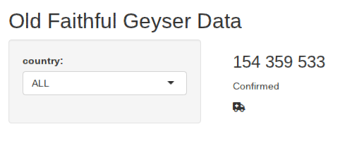
Figure 1: Our app is still very simple, but it does display the latest total number of Covid-19 infections.
First we will change the basic layout of the app from standard bootstrap to the elegant dashboard interface of shinydashboard. This is done by loading the library shinydashboard and replacing the main function in the user interface from fluidPage() to dashboardPage(). We also add a dashboard header and replace the sidebard with the dashboardSidebar(), add a title, etc. The first lines of the ui in the file app.R look now as follows:
1 2 3 4 5 6 7 8 9 10 11 12 13 14 15 16 17 18 19 20 21 22 23 24 25 26 27 | ui <- dashboardPage(
skin = 'red',
dashboardHeader(title = "My Covid Dashboard"),
dashboardSidebar(
sidebarMenu(# nice layout + indication which one is active
# Header:
h4('Selected Country'),
# selct the country input:
selectInput('sel_country',
"country:",
gc_countries,
selected = NULL,
multiple = FALSE,
selectize = TRUE,
width = "100%",
size = NULL),
# a separator:
hr(),
# the menu items:
menuItem("Main Page", tabName = "dashboard", icon = icon("th")),
menuItem("Forecast", tabName = "forecast", icon = icon("sun"))
) #close sidebarmenu()
), # close DashboardSidebar
|
The app will now look as follows:
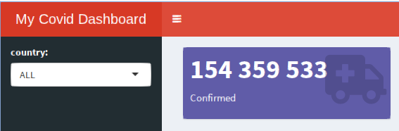
Figure 2:Now, the app looks like a real dashboard, but we only started to work on it.
Now, we have a fully functioning app that loads the latest covid data and displays just one number. We will now expand the app so that it beocomes more meaningful. Along the way we will also improve the code slightly.
Wit the following code we prepare more pages, enrich the menu, and make it look nicer.
1 2 3 4 5 6 7 8 9 10 11 12 13 14 15 16 17 18 19 20 21 22 23 24 | dashboardSidebar(
sidebarMenu(# nice layout + indication which one is active
# Header:
h4('Selected Country'),
# selct the country input:
selectInput('sel_country',
"country:",
gc_countries,
selected = NULL,
multiple = FALSE,
selectize = TRUE,
width = "100%",
size = NULL),
# a separator:
hr(),
# the menu items:
menuItem("Dashboard", tabName = "dashboard", icon = icon("th")),
menuItem("Forecast", tabName = "forecast", icon = icon("sun"))
) #close sidebarmenu()
), # close DashboardSidebar
|
We can test the code by clicking Run App, however the new buttons won’t work yet (they do not generate an error message either).
We need to connect each tabName to the content in the dashboardBody(). This can be done by adding a tabItem with the corresponding name in the dashboard body (for example wrapped in the function fluidRow() – which produces a Bootstrap row of 12 unit lengths: this creates rows that turn into columns in narrower screens).
Here is a minimal example:
1 2 3 4 5 6 7 8 9 10 11 12 13 14 15 | dashboardBody(
fluidRow(style='padding:5px;',
tabItems(
tabItem("dashboard",
h1('The Dashboard'),
valueBoxOutput("infected_box", width = 6)
),
tabItem("forecast",
h1('The Forecast'),
HTML('<h1>TBA</h1>') # we will add this later
) # close tabItem
) # close tabItems
) # close fluidRow
) # close dashboardBody()
) # close dashboardPage
|
Again we can test the app at this point, and now we can select other pages in the menu. For example, if we choose Forecast, then we will see the message “TBA”. So, the layout framework is operational and we can focus on the content.
Now, we need to develop the code (server function) and html5 ui for each tabItem. First we focus on the main dashboard. Now it is the following block.
We can now copy the following code in the beginning of the dashboardBody():
1 2 3 4 5 6 7 8 9 10 11 12 13 14 15 16 17 18 19 20 21 22 23 24 25 26 27 28 29 30 31 32 33 34 35 | dashboardBody(
div(style='padding:5px;',
tabItems(
tabItem("dashboard",
h1('The Dashboard'),
column(6,
valueBoxOutput("infected_box", width = 12),
valueBoxOutput("sick_box", width = 12),
shinydashboard::box(
width = 12,
title = "Sick as a percentage of Confirmed",
gaugeOutput("sick_gauge", width = "200px", height = "200px")
)
),
column(6,
valueBoxOutput("recovered_box", width = 12),
valueBoxOutput("death_box", width = 12),
shinydashboard::box(
width = 12,
title = "Deaths as a percentage of Confirmed",
gaugeOutput("death_gauge", width = "200px", height = "200px")
)
)
),
tabItem("forecast",
h1('The Forecast'),
HTML('<h1>TBA</h1>') # we will add this later
) # close tabItem
) # close tabItems
) # close fluidRow
) # close dashboardBody()
) # close dashboardPage
|
Note that:
h1()generates a level 1 header (it is the heading of the first tabItem)- We choose a layout in columns. Each function column, takes as first argument the width (e.g.
column(6, ...)). Rember that the total width at each level is 12. Even if within the column of width 6 we start a new column, then this will again get a maximal width of 12. - Some items are wrapped in
shinydashboard’s functionbox(). This draws a box around the items in it, but also allows to add a title to the items. - Each column has two value-boxes and one gauge plot. These still need to be generated. The code will work, but the plots are not displayed till we add in the server function the corresponding output variable.
To create the dynamic output that for which we created the output framework, we need the following code. Note that we decided to lift the data genearation for one country out of the renderValueBox() function, because we need it in every value box.
To make this data respond to the user’s input, we need to wrap it in the function reactive(). Later, we can refer to it as a function (last_numbers()). Since it is a named vector of values, we can get the last number of confirmed infected people for example as last_numbers()$Confirmed.
1 2 3 4 5 6 | # We extract only once the last numbers of the selected country:
last_numbers <- reactive(
get_last_numbers(d = gc_dts_countries, theCountry = input$sel_country)
)</p>
<p>
|
The app is no fully functional and the first page will look as follows:
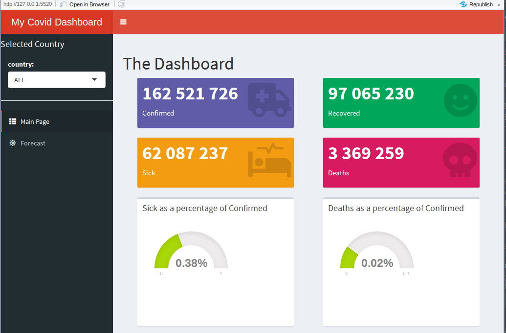
Figure 3:The first page of the dashboard is finished.
All that rests to do now the second functionality: generate a forecast.
For the forecast, we will start from the server function. This will make clear what we want to do and what is needed in the ui.
1 2 3 4 5 6 7 8 9 10 11 12 | # The data for the selected country:
d <- reactive(get_dts_country(gc_dts_countries, input$sel_country))
# The forecast plot:
dd <- reactive(add_forecast(d(), # timeseries for the given country
input$sel_data, # e.g Sick, Confirmed, etc.
input$dte_start, # starting date for the data to use
input$f_nbrDays # number of days to forecast
))
# Prepare the plot for output:
output$plot_frct <- renderPlotly(plot_forecast(dd(), input$sel_data))
|
This makes clear that in the input we will need the following input variables:
sel_country: which country is selected. We already have that one. This one is defined in the side-bar of the dashboard and is considered as an over-arching choice for the firsttabItem(“dashboard”) and the second (“forecast”))sel_data: the data to be used (confirmed, sick, deaths or recovered)dte_start: the starting data. As the pandemic evolves, the dynamics evolve and we cannot expect that our simple forecast (based on an exponential model) will make sense on all dataf_nbrDays: the number of days to forecast
If we would like to compile the app, it will fail. Going through the error message, you might find that we miss the function plot_forecast(). This function can be added in the server function or in global.R
We decide to add it in the global.R file, beasue it does not need reactive code and is rather lengthy.
Add the following to the global.R file:
1 2 3 4 5 6 7 8 9 10 11 12 13 14 15 16 17 18 19 20 21 22 23 24 25 26 27 28 29 30 31 32 33 34 35 36 37 38 39 40 41 42 43 44 45 46 47 48 49 50 51 52 53 54 55 56 | add_forecast <- function(d, # timeseries for the given country
theRow, # e.g Sick, Confirmed, etc.
dte_start, # starting date for the data to use
f_nbrDays = 14 # number of days to forecast
) {
# prepare the data
dd <- d %>% filter(Date > dte_start)
dd <- dd[complete.cases(dd),]
x <- dd$Date
y <- dd[[theRow]]
n <- 1:nrow(dd)
N <- max(n)
dd <- cbind(dd, n, y) # we add a column y (universal name for the dependent variable)
# find good starting values
theta.0 <- min(y) * 0.5
model.0 <- lm (log(y - theta.0) ~ n)
alpha.0 <- exp(coef(model.0)[1])
beta.0 <- coef(model.0)[2]
starts <- list(alpha = alpha.0, beta = beta.0, theta = theta.0)
model <- NULL
try({
model <- nls(y ~ alpha * exp(beta * n) + theta,
data = dd, start = starts,
#algorithm = 'port',
nls.control(maxiter = 1000, minFactor = 0.000002, tol = 1e-03))
}) #try
if(f_nbrDays > 0) {
df_frcst <- tibble(
Date = as_date((max(dd$Date) + days(1)):(max(dd$Date) + days(f_nbrDays - 1))),
y = NA, #NOTE: we use y instead of Sick, Confirmed, etc.
n = (N + 1):(N + f_nbrDays - 1)
)
dd <- bind_rows(dd, df_frcst)
}
#df <- df %>% dplyr::mutate(Forecast = predict(model, newdata = df)) ## fails ... Error: Column `Forecast` must be length 1 (the group size), not 74
dd$Forecast <- predict(model, newdata = dd)
return(dd)
}
# ----- return the plotly plot
plot_forecast <- function(dd, theRow) {
plot_ly(dd, x = ~Date, y = ~y, type = 'scatter', name = "Daily people sick",
mode = 'markers', marker = list(size=8)) %>%
add_trace(x = ~Date, y = ~Forecast,
mode = 'lines', type = 'scatter', name ='Model Estimate', line = list(width = 3), marker = list(size=1)) %>%
layout(
title = paste("Forecast for:", theRow),
xaxis = list(title = "Date"),
yaxis = list(title = "Number of People"),
#autosize = TRUE,
showlegend = TRUE)
|
As one can see from the code, the functionality works in two steps. First, we define a function that fits the model, then we define a function that uses this model to visualise it.
Again the app can be opened now, but the new tab will still not show up. To visualize the forecast, we need to build the ui.
We will now need to replace our placeholder for the forecast output in our ui. So, replace
1 2 3 4 | tabItem("forecast",
h1('The Forecast'),
HTML('<h1>TBA</h1>') # we will add this later
) # close tabItem
|
with:
1 2 3 4 5 6 7 8 9 10 11 12 13 14 15 16 17 18 19 20 21 22 23 24 25 26 27 28 29 30 | tabItem("forecast",
h1('The Forecast'),
fluidRow(
shinydashboard::box( #input of extra variables
title = "Make your choice",
selectInput("sel_data",
"Data:",
gc_impact_types),
dateInput('dte_start', 'Use data from:',
value = gc_last_date %m-% months(1),
min = gc_first_date, max = gc_last_date,
format = "yyyy-mm-dd", startview = "month",
weekstart = 0, language = "en" ),
sliderInput("f_nbrDays", "Number of days to forecast:",
value = 14, #the default is
min = 1, max = 90,
step = 1, round = TRUE)
)
),
fluidRow(
shinydashboard::box( #input of extra variables
width = 12, # default is 6
title = "The forecast",
plotlyOutput('plot_frct',
width = "100%", height = "350px", inline = FALSE
)
)
),
) # close tabItem
|
Finally, the app if finished and the forecast page will look as follows:
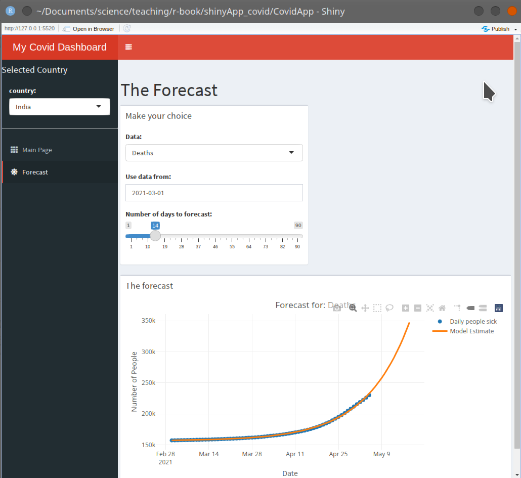
Figure 4:The forecast page.
With little effort we created a fully functional app that interacts with the user and uses the user’s input to calculate and visualise things that the programmer might not have expected (e.g. special choices of dates), or that look different every day (since we pull in new data at the start). Obviously there is still a lot that can be improved:
- the mathematical model in the first place needs improvement
- a wider range of models would make sense (e.g. a logistic curve, and ARIMA model, etc.)
- and above all there is much, much more possible, but that dashboard is already available: see Philippe’s Covid19 dashboard
Anyhow, I hope that this gets you started on sharing your data, analysis, and insights.